Making Access Bank feel young again.
An unsolicited redesign of the Access mobile banking app, reimagined for a younger, style-driven African audience.
Solo project, no team. Designed and presented independently.
Brand direction, color system, iconography, and UI screens across auth, dashboard, and transfers.
Concept, pitched to the marketing team as one option among several. No dev handoff.
Brand & UI redesignFrom basic banking utility to a brand young people want to open.
Access Bank is one of the leading banks in Nigeria, but its mobile app still reads as purely functional: flat, dated, and built for a much older audience.
This project pitched a different direction: keep the trust of the brand, but give the app the color, confidence, and polish a younger customer expects from the apps they use every day.
Built as a concept and shared with the marketing team as one option among several, this is pure UI and brand exploration: no code, no dev handoff, just the case for a bolder Access.
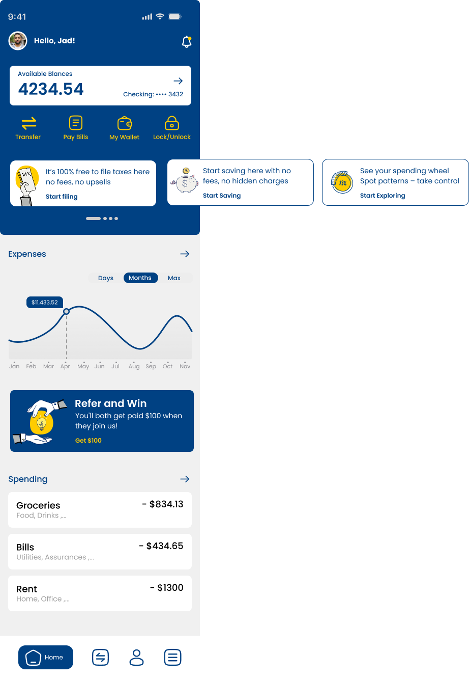
A richer, warmer take on navy and gold.
Reference pulled from mosaic pattern work, brushed metal, and marble: deep navy grounded by a confident gold, textures that feel premium rather than corporate.

A confident, high-contrast palette.
Navy carries the weight and trust of the brand. Gold is used sparingly, on calls to action, active states, and accents, so it stays energetic rather than gimmicky. White keeps every screen legible and calm.
Icons drawn to match the type.
Built from scratch in Figma to sit naturally next to Poppins: the same rounded, smooth stroke language, rendered in navy on light surfaces and gold on navy.


Poppins, doing all the work.
One typeface, four weights. Rounded, geometric, and friendly enough to soften a banking app without losing authority.
The redesign, applied end to end.
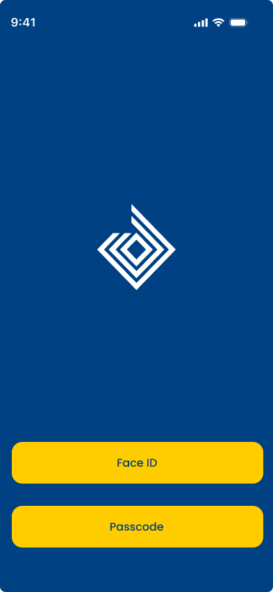
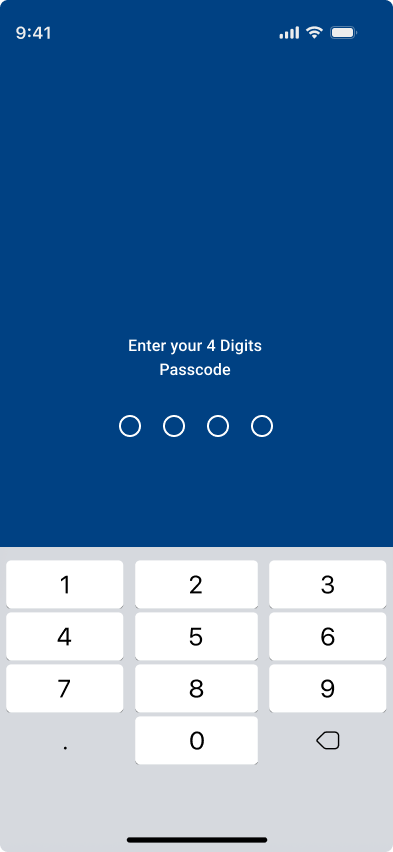
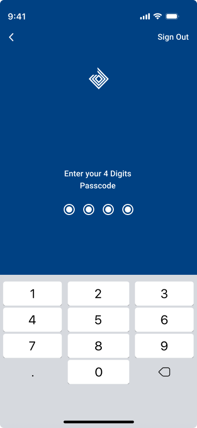
Authentication

Home & overview
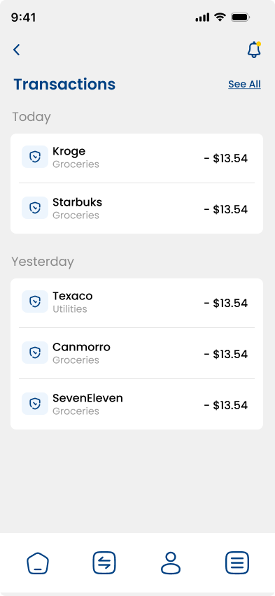
Transactions
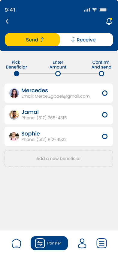
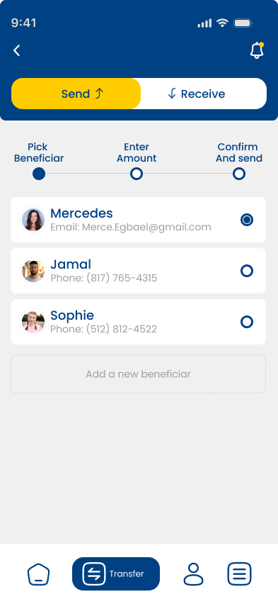
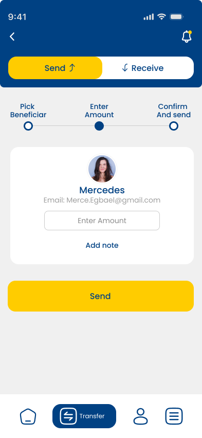
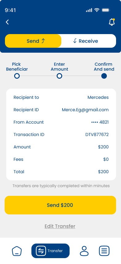
Send money flow

/Frame 19.png)
/Frame 493.png)
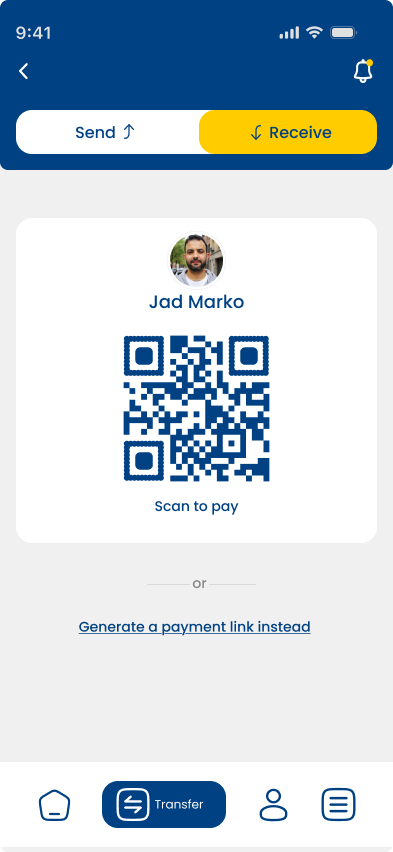
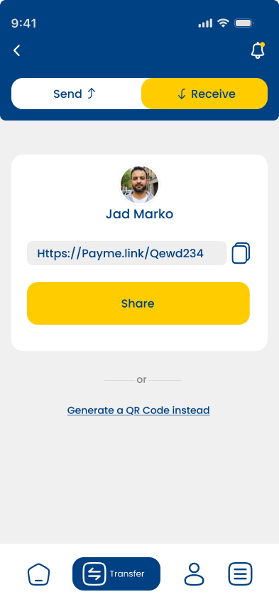
Receive money flow
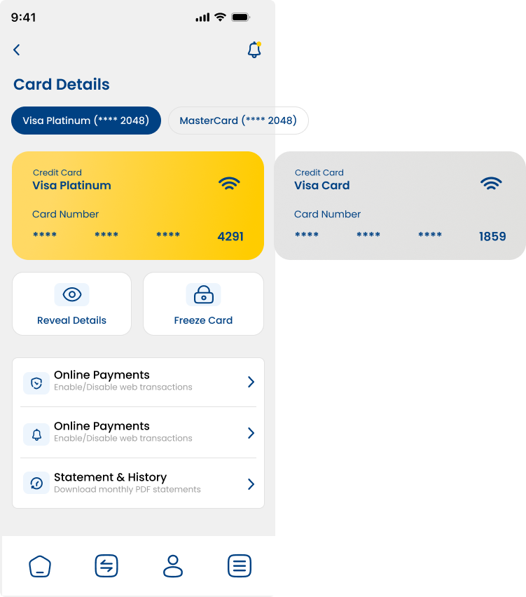
Card details