One card, every layout it needs to handle
I designed and published a multi-purpose card component set for Figma that supports both horizontal and vertical layouts in light and dark themes. Built with Auto Layout, the cards adapt smoothly to different content and mobile use cases, making them easy to reuse across dashboards, apps, and websites.
I shared it on the Figma Community under CC BY 4.0, and it's since been adopted by hundreds of designers and tagged for auto layout, mobile, and modern card use.
designers using and remixing the file
Free to duplicate and remix on the Figma Community, licensed CC BY 4.0.
View the live Figma template ↗Vertical and horizontal, each in light and dark
Every card ships with a title and text toggle, so the same component can flex from a full editorial card down to a bare image-and-arrow tile without breaking the Auto Layout structure.
Image on top, content stacked below. Title and body text can each be switched off independently while the card stays balanced.
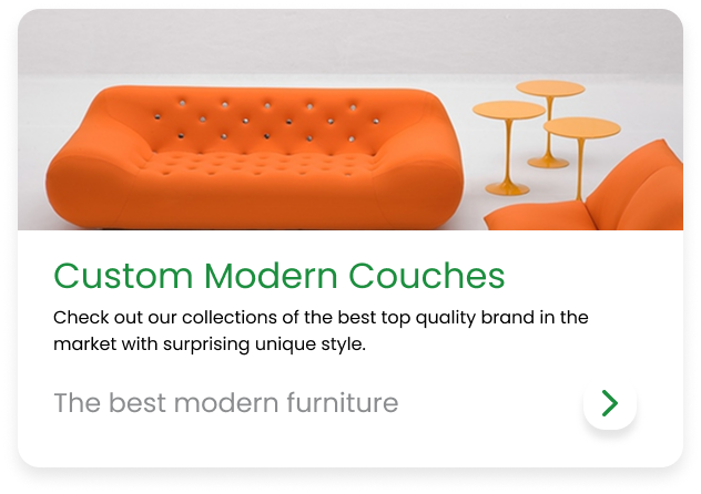
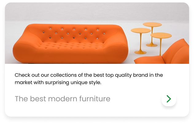
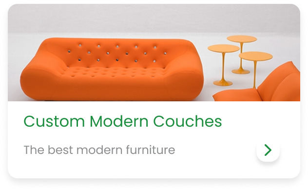

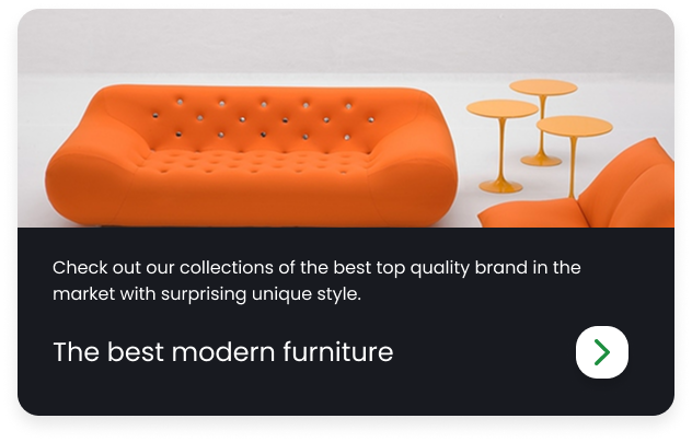
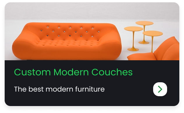
Image and content sit side by side, tuned for list-style layouts and dense dashboards where vertical space is limited.






A component that keeps getting reused
What started as a single Auto Layout exercise became a free Figma Community file, shared under CC BY 4.0 and now adopted by hundreds of designers building dashboards, apps, and websites.
View the live Figma template ↗