← Back to portfolio
UI / Redesign
01
What I did
Simplify, clarify, convert
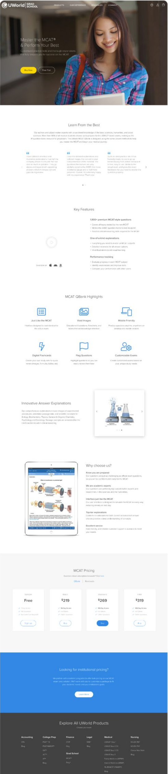
I cut the structure down, rewrote the hero so the value prop actually lands, and tightened the microcopy across the page. Then I reworked the hierarchy, the CTAs, and where the social proof sits so people understand what they're getting faster and get pushed toward sign-up.
None of that was a guess. I pulled Hotjar heatmaps and scroll data plus Google Analytics traffic and funnel numbers to see exactly where people lost interest and which sections actually held attention.
02
Before & after
The landing page, rebuilt
Scroll each panel to compare the full page, before and after.
Before
→
After

03
The payoff
A clearer path to sign-up
Tighter hero copy, a clearer hierarchy, and social proof placed where people actually look. Visitors now have a straighter line from landing to sign-up, and the page still looks like it belongs to the same brand.