A side gig, built to be shared
This visa booking app project focused on designing a frictionless signup and sign-in experience that feels trustworthy, modern, and visually balanced. It was a fun, hands-on exercise in building a reusable UI system around clear hierarchy, color balance, and tidy interaction patterns.
I published it to the Figma Community as a free template, and it's now being used and remixed by hundreds of designers.
designers using and remixing the template worldwide
Free to duplicate and remix on the Figma Community.
View the live Figma template ↗Five screens, two full themes
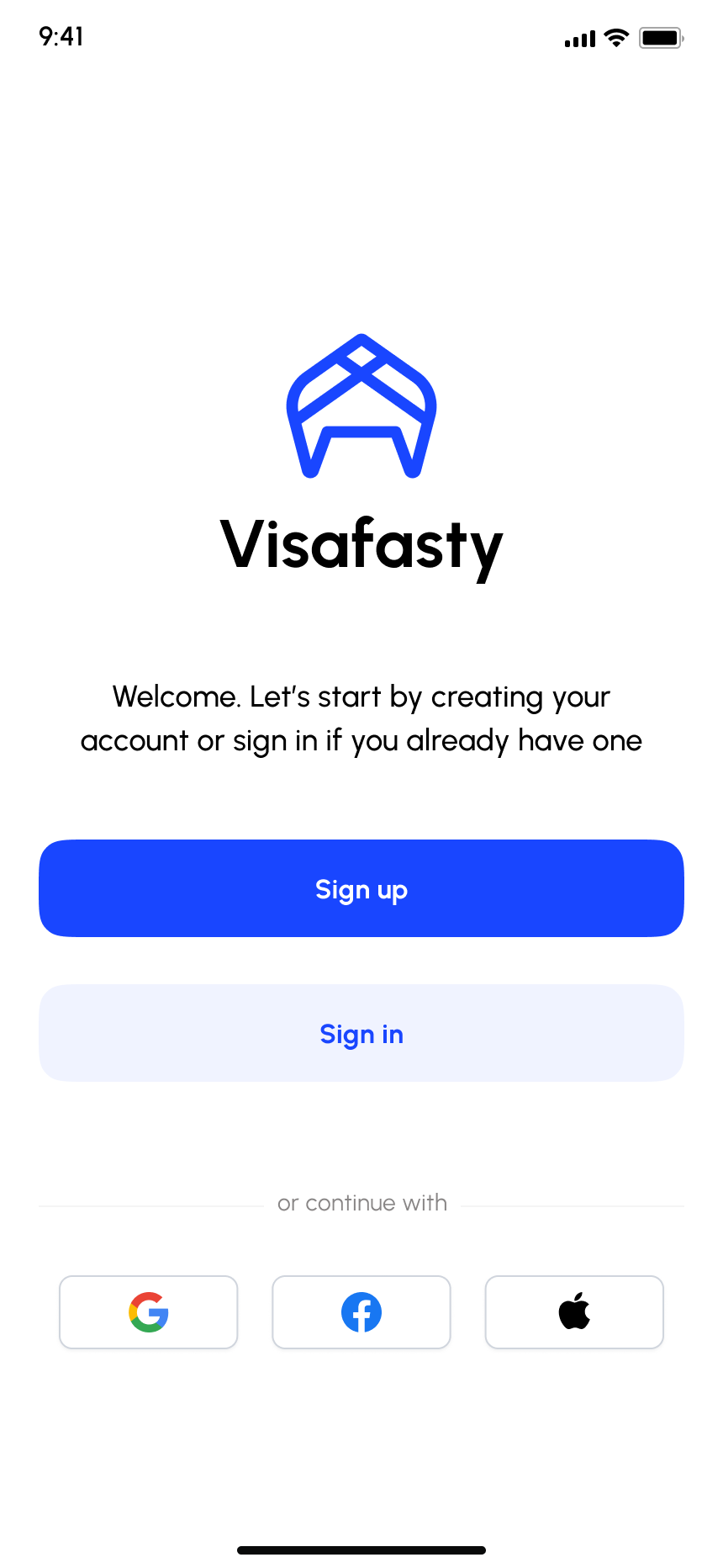
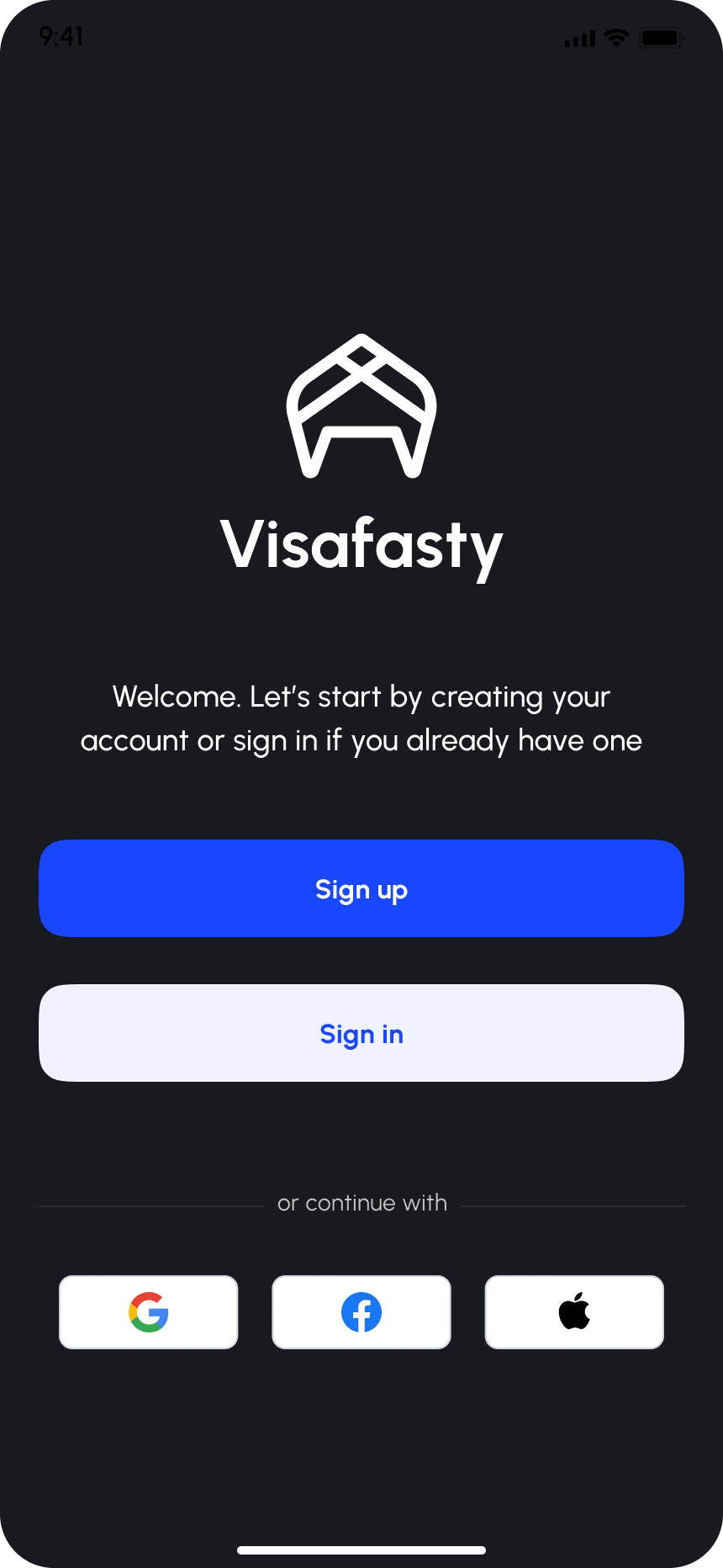
Every screen in the flow was designed twice: a light theme for a clean, airy first impression, and a dark theme for a more premium, focused feel. Both ship in the template.
The launch screen: logo, wordmark, and a loading indicator that sets the tone before the app even opens.
One clear decision point: sign up or sign in, plus three social auth options, all with generous touch targets and calm spacing.
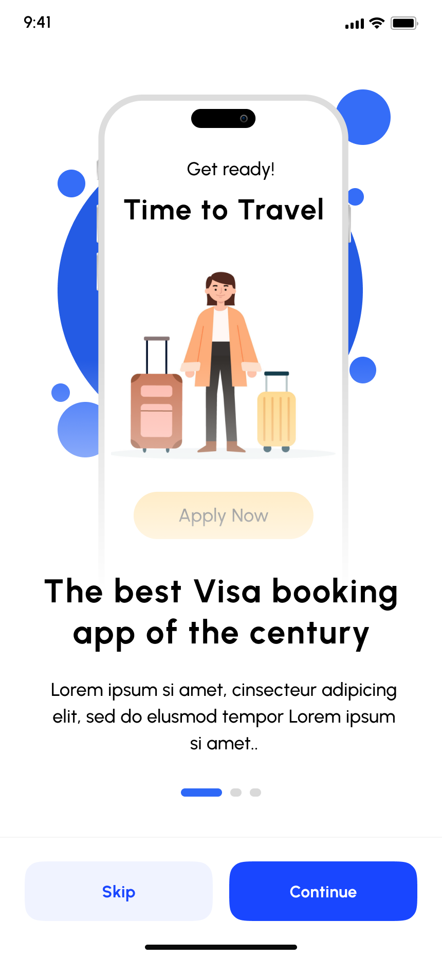
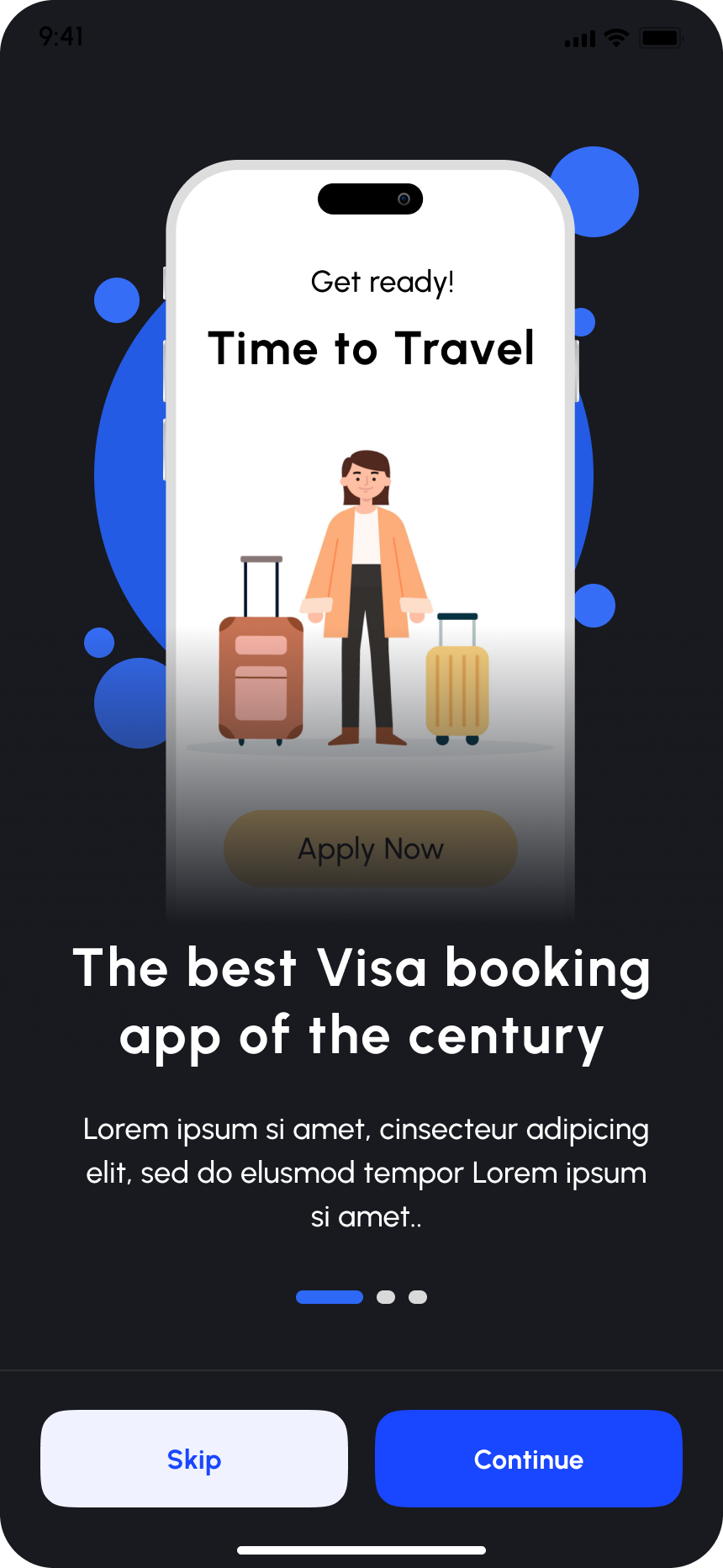
A playful device-frame illustration introduces the app's core promise before asking for anything from the user.
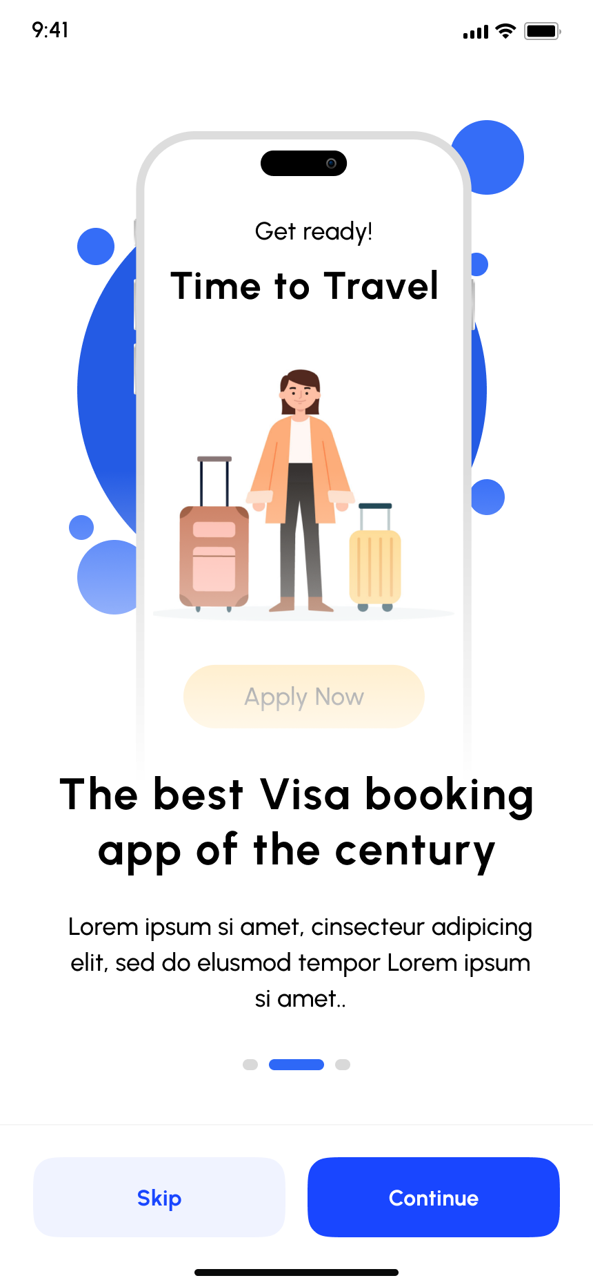
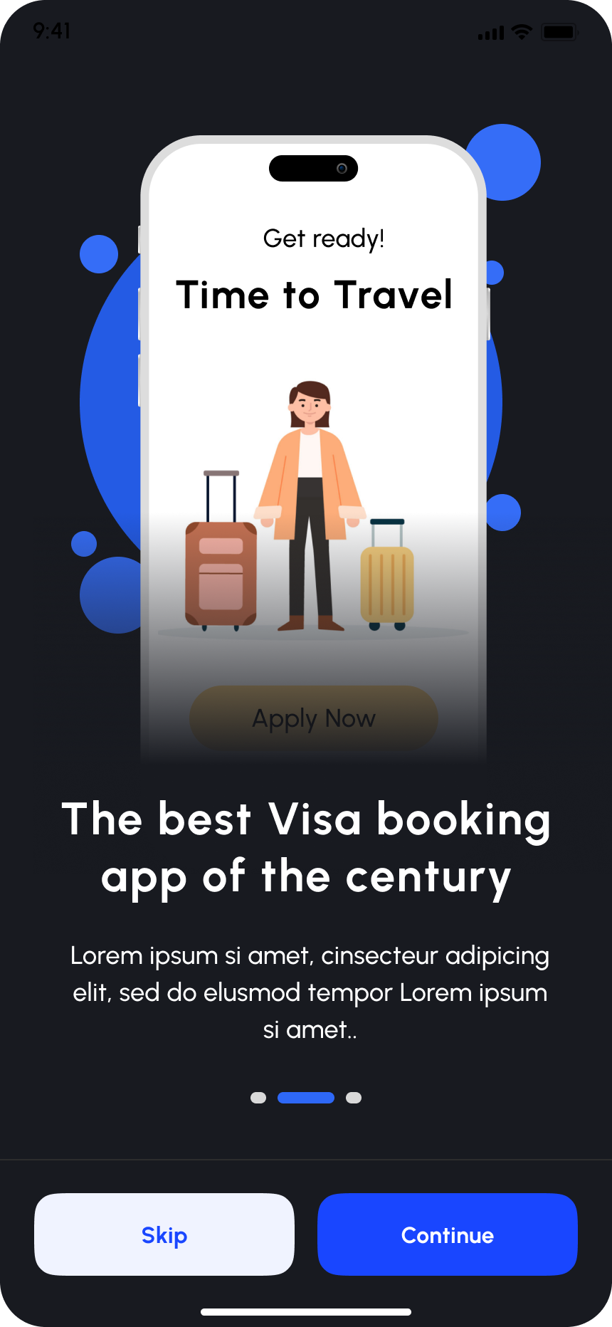
Same layout, progress dot advances: consistency across the carousel keeps orientation effortless.
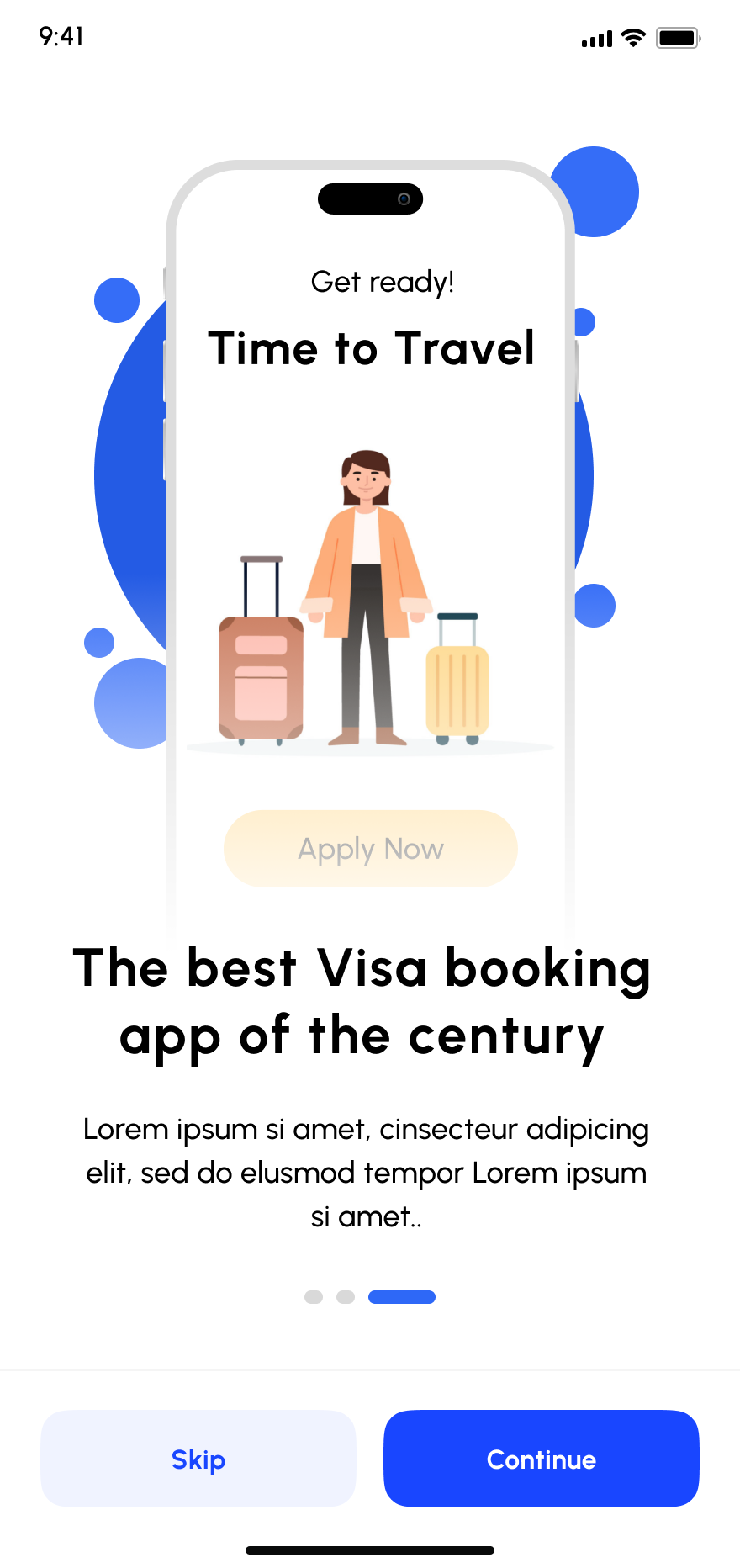
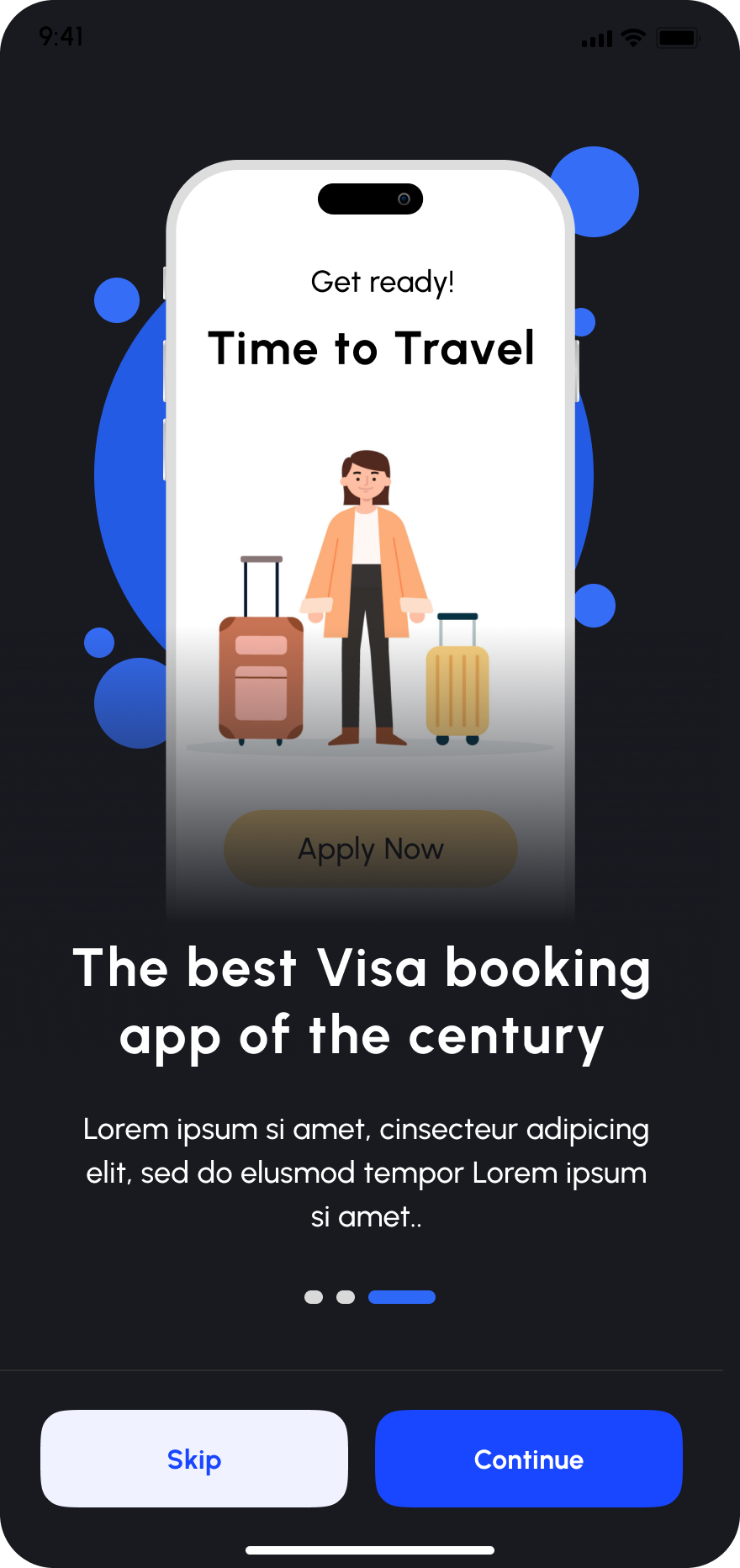
The final carousel step, ready to hand off into sign up. Skip stays available at every step for returning users.
A reusable system that found its own audience
What started as a hands-on exercise in hierarchy, color balance, and tidy interaction patterns became a free Figma Community template, now used and remixed by 640+ designers worldwide.
View the live Figma template ↗