
What worked, what didn't
I reviewed the Zales.com product page on desktop and mobile to see where the experience held up, and where it was working against the shopper.
Zales provides comprehensive product information, a significant advantage that helps potential customers make informed decisions, which can lead to higher conversion rates.
Detailed, categorized navigation makes it easy for visitors to explore the site, find products, and move through the purchase process smoothly, a positive experience that lifts conversion.
Overcrowding the page with product and promotional information overwhelms users and makes it hard to quickly digest content, so shoppers can miss the key areas of interest, like making a purchase.
Unbalanced white space and layout hierarchy, particularly on mobile, hurt usability. A more balanced use of white space and an optimized layout hierarchy, especially on mobile, would enhance the experience.
Solving the two identified issues
Here's how I addressed the two UX issues found on Zales.com.
Prioritized key information: identified the most critical product details and promotions that deserve prominent placement, and made sure they're highlighted and easily visible.
Collapsed secondary information into expandable sections users can open to reveal additional details, reducing clutter and giving users control over what they see.
Used visual hierarchy, larger sizes and stronger contrast, to draw attention to the most important elements and direct focus to the Add to Cart CTA.
Established a consistent 8-point grid for layout and spacing, aligning elements, margins, and paddings to multiples of 8 pixels for a harmonious layout.
Rethought the distribution of white space so it frames content and supports readability, balancing padding and margins for a more compact, visually pleasing layout.
Following thorough research and analytics, it seems Signet uses Smartedit as the platform for managing e-commerce sites across all its brands, including Zales. Given the constraints of that platform, the two improvements above were strategically scoped to the areas editable within the Smartedit CMS.
The product page, rebuilt
Compare the live before against the redesigned after, on desktop or mobile.
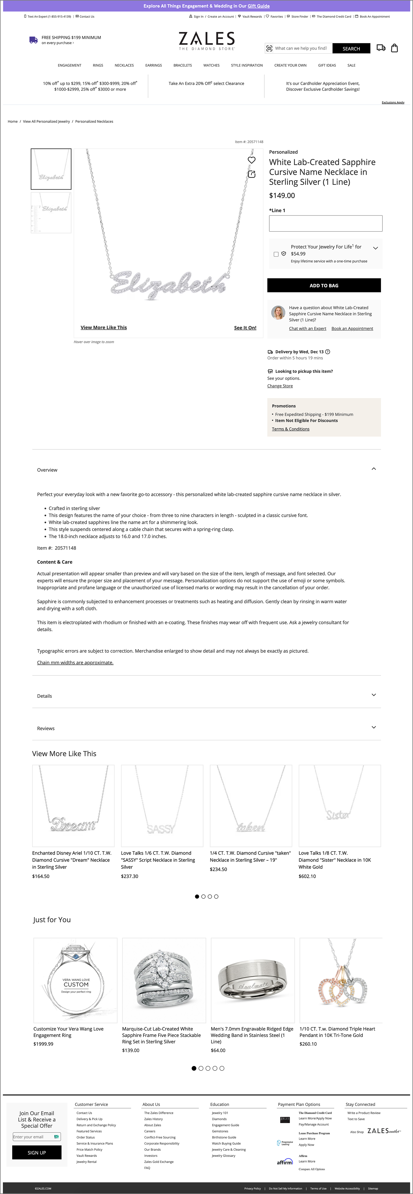
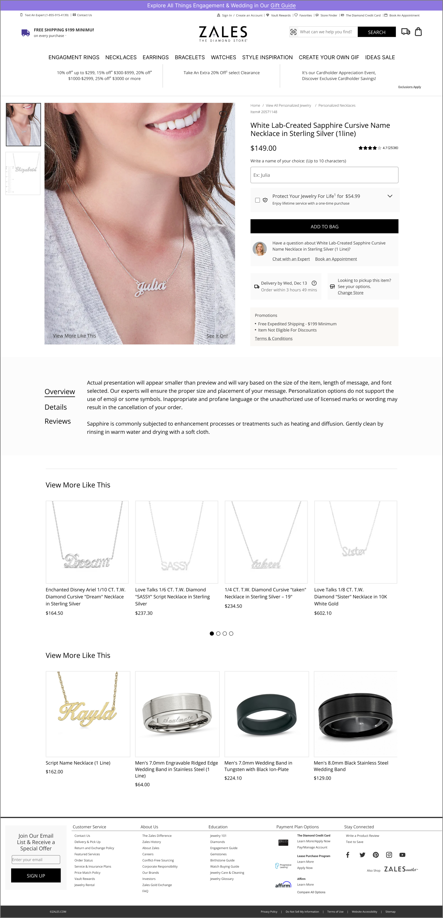


A clearer path from browsing to buying
Streamlining what's on screen and grounding the layout in a consistent grid cut the visual noise on Zales' product page and pulled focus back to the details that drive a purchase, all within what Smartedit's CMS allows the team to edit.